PWA App • May 2025 — Oct 2025
Using AI to build a Flutter Progressive Web App
In this post I’ll break down how I went from frames in Figma to a polished web app built with Flutter that’s already being used by students in Durban, South Africa.
I’ve always harboured a passion for building the things I imagine. From the time I was about 8 years old and moved a mouse cursor for the first time, my curiosity for how computers work and how software is built was piqued — a curiosity that still drives me today. It’s the reason I got into UX, and the reason I have continued to tinker with coding in the background. Understanding how interfaces come alive is half the fun of designing them.
From the end of 2024, I began redesigning the UX for SKKSA’s MyDojo karate student portal. I had built the first version back in 2020 using MySQL and PHP (cobbled together with a basic Bootstrap frontend). That version got convoluted over the years and it was time to start over.
I was introduced to Flutter by a product owner at work, and after digging into it, quickly realised that this might be the closest I’ve ever come to the elusive dream of the “write once, run anywhere” philosophy. I was impressed by Dart's relatively shallow learning curve, and Flutter's efficiency in getting you setup and running a web app literally within minutes.
Time to work smarter, not harder.
RELATED UX CASE STUDY
Redesigned a legacy platform with
enhanced community-driven experiences
Browse the MyDojo UX case study here →
A QUICK NOTE
In my perspective, coding with AI is distinct from vibe coding, an activity I view as useful when rapid prototyping. In this project, I was able to leverage AI to jumpstart building my designs for real-world use, not design validation. This, of course, requires a foundational understanding of core coding concepts, and insight into your chosen app framework. For me that was Flutter (and Dart, its language). I was fortunate to have some basic coding background in C# and PHP, which made it easy to pick up Dart and understand Flutter's widget-based nature. Having this base knowledge makes it more efficient downstream, when you need to trawl through thousands of lines of code to fix the quirky things AI spits out.
GOING PWA-FIRST
Progressive Web Apps are mobile apps that run in the browser but exude a native app experience (no browser chrome, full-screen UI, and launched from a phone’s home screen).
I chose this route as it was a low barrier to entry: it’s economical, being able to bypass the App Store and Play Store developer fees, and for the project’s userbase size, it didn’t make sense to build a full-on native experience that only a few hundred users would actually use.
CHALLENGES WITH PWAs
Going PWA does bring up a UX challenge: compared to native apps, the installation process is a bit more involved. Users have to add the site to their home screen rather than install from an app store. This is a deviation from their mental model. To avoid friction, I spent time unpacking the installation journey.
In the end, avoiding jargon like “PWA” was essential, and directional logic gates ensured that users were presented with contextual guidance based on their current device:
Desktop users are instructed to scan a QR code that opens the “add to home” screen on their phone
Android and iOS users are presented with OS-specific instructions on how to install the app
Once installed, the app jumps the user to the sign-in screen
ROUTE MANAGEMENT
To manage the routing of this and all screens in the app, I used GoRouter. This made it familiar to me coming from the old PHP/HTML based platform, as it mimics URL-based deep linking.

"INSTALL AS PWA" FLOW
This was how the resultant screens looked for a user depending on their device or platform. The iOS version has a Lottie animation that demonstrates the add-to-home interaction.

TECH STACK
The tech stack was kept intentionally lean to allow for easy maintenance whilst still remaining robust and secure:
Flutter Web for the UI and logic
Supabase for authentication, database and limited storage
PHP for sending emails (to send automated emails when certain events are triggered, e.g. when a user signs up for the first time)

I’ve found Flutter to have excellent support with ChatGPT-5. Copying Figma frames as PNG and providing some key context generally outputs decent-enough Dart code that can be plugged into a Scaffold fairly quickly. A quick Hot Reload and boom — the Figma design is instantly alive as real code rendered in my browser.
ChatGPT became somewhat of a code-counsellor for me, helping me get answers quickly to common roadblocks as I stumbled through building the app. For example, learning about RLS policy settings and Edge functions by simply asking questions as I built saved me having to trawl through hundreds of Stackoverflow or Reddit posts.
And yes, I could've used something more sophisticated like Cursor. But I'm comfortable with VS Code, and found this workflow to be efficient for my needs. That's another important distinction: use the tools you know, and use AI to elevate your workflow; see it as an enhancer, not a replacement, for your intuition and thinking.
In the past, I would've had to piece together answers from various forums and Reddit posts to figure out how to achieve something. With AI, I was able to riff with the bot on the exact problem I was facing, and directly iterate on solutions. This saved a ton of time.
KEY INSIGHT
Having a clear vision of what you want to build, and what you’re going to use to build it, helps tremendously speed things up. But how you build it — especially when there’s agentic AI in the mix — is just as important. The next section delves into my workflow on this project.

BREAKING UP THE PROBLEM
It’s tempting to view AI tools like ChatGPT as the answer to all your problems. The problem is: despite it being really efficient at delivering answers (the quality of which is still debatable), it struggles when you overload it. I’ve often found this to be the cause of its low-quality output when coding alongside it.
Taking Flutter’s widget-based approach, I decided to chunk the problem of building my screens:
For each screen, I broke it up into constituent elements
I identified which elements could be reusable across multiple screens
With the help of ChatGPT, I created individual widgets for each of those elements, each with their own input parameters to accept things like string inputs to display relevant content
I could then call a widget when needed and, doing so, assemble the screens as per my Figma design. This part I mostly did manually, giving me full control over each page's code.
An example was the stylised Heading bar, used to denote a section of content on a screen:

Dart:

Heading bar widget → Reusable Widget code → Implementation in the Profile Selector screen
Key insight: break-up your problem into smaller, digestible chunks. This way both you and the AI won't be overwhelmed — and you'll maintain control over the final result.
BRINGING IT TOGETHER
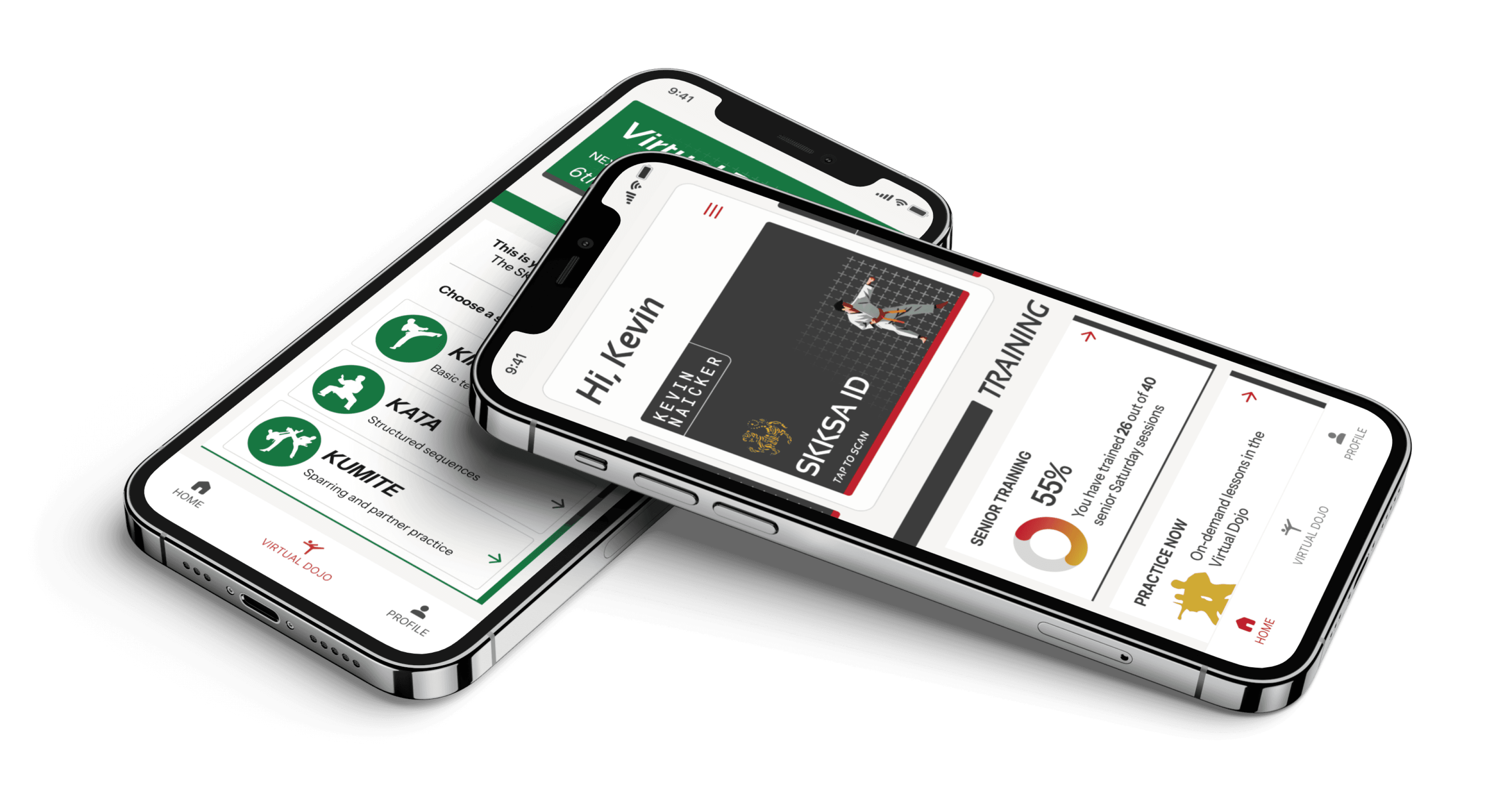
This is the app's Home screen:

You'll see how it's actually composed of separate widgets, each built with the help of careful prompting. Some widgets are reusable, others are specific to their use-case (e.g. the "Progress" card has dynamic logic mapped to the user's current belt grade).
STYLING THE APP

In the screenshot above, notice how, by applying the custom AppTheme, the visual identity is instantly set.
The entire app is actually built on top of a modified version of Google's Material Design system. Material 3 is fully baked-in to Flutter (since Flutter is a Google product). So, instead of reinventing the wheel for common UI elements like textboxes and buttons, I was able to customise Material to fit my needs by modifying the AppTheme class.

This means no matter the amount of prompting and integrating of AI-generated code, the look and feel remained consistent. It also makes the app stand out from the crowd of Material-based apps, whilst still leveraging all the good usability and aesthetic effects that comes with such a robust design system.
For example, by building upon Material 3, I was able to harness interaction patterns like bottom sheets, slideovers, and floating input labels.

KEY INSIGHT
Don't reinvent the wheel. Take time to setup the overall style rules before you get too far into development.
Using AI to build apps is a tricky conversation. For many, the immediate instinct is "get the AI to build it all, and nudge it with continuous prompting until the right outcome is achieved."
This is a dangerous approach. It's important to understand what the AI is spitting out. Maintaining human control over the overall codebase is essential when you need to maintain, enhance and upgrade the project in future.
So I like to think of this workflow as "coding with AI", harnessing its ability to retrieve information in a central place. This enabled me to solve problems faster.
Methods like chunking by building individual UI components/widgets, and harnessing existing UI libraries (like Material 3, which I highly customised), makes things efficient. This helps you avoid reinventing the wheel.
Of course, there's still a lot of deep thinking and planning required — human thinking, not agentic 😉. The installation process, for example, required some careful consideration and wireframing, as has subsequent enhancements to MyDojo, including building out a digital registration and re-registration process for the club's annual affiliation admin (more on that in a future post). I found it useful to map out the entire data structure, to draw-out many of the intricate processes involved in flows like user account creation, profile linking, and map out the complex logic of tying belt colour to grade. In these instances, AI helped extend my thinking, and provide the missing pieces necessary to making it all click.
For smaller app projects like this, especially when time is limited, this workflow was highly economical and efficient. Obviously this does not replace the capabilities and expertise a full dev team would bring. There's much I still have to learn, especially backend topics. But Flutter has been a great platform to translate my ideas from Figma frames into a real, working app that's currently being used to help students learn, and help SKKSA deliver digital content and experiences to enrich their in-dojo offering.
Want to learn more about this project?
Get in touch