I led the redesign of the Financial Health Snapshot (DSI) feature for DebtBusters, transforming a confusing feature into an experience that now drives 20% of client acquisitions. Working with a research partner, I translated usability issues into targeted UX improvements, crafting an interactive narrative that merges and highlights the company's value proposition with the user's personal situation.
My role
Led UX and UI design
Consulted on usability testing plan with the UX research partner
Reframed a UI fix brief into a new lead journey
Project type
Fintech
Lead generation
Responsive web
Company
DebtBusters
Date
May - August 2025


Debt-to-income ratio (DTI) is a metric that indicates whether someone can manage their financial burden. The higher the percentage, the less sustainable their situation is.
The average debt-to-annual-income ratio in South Africa is over 112%, indicating a population under severe debt stress. A sustainable DTI is considered to be below 40%.
The Financial Health Snapshot widget on DebtBusters' (a leading financial services company specialising in debt relief solutions) client platform is a key feature that attempts to illustrate a user's personal debt to income ratio.
However, the original widget left users confused, and had a missed conversion opportunity hidden beneath a cluttered visual design with ambiguous copy.
Working with our research partner, we uncovered fundamental issues with clarity and information hierarchy in the original design.
Users expressed that:
"The solution is not there on the first page. I'm not seeing it."
"This shows it's likely they can help with a consolidation solution. But based on what?"
"It's so many things and you don't really know what to focus on."
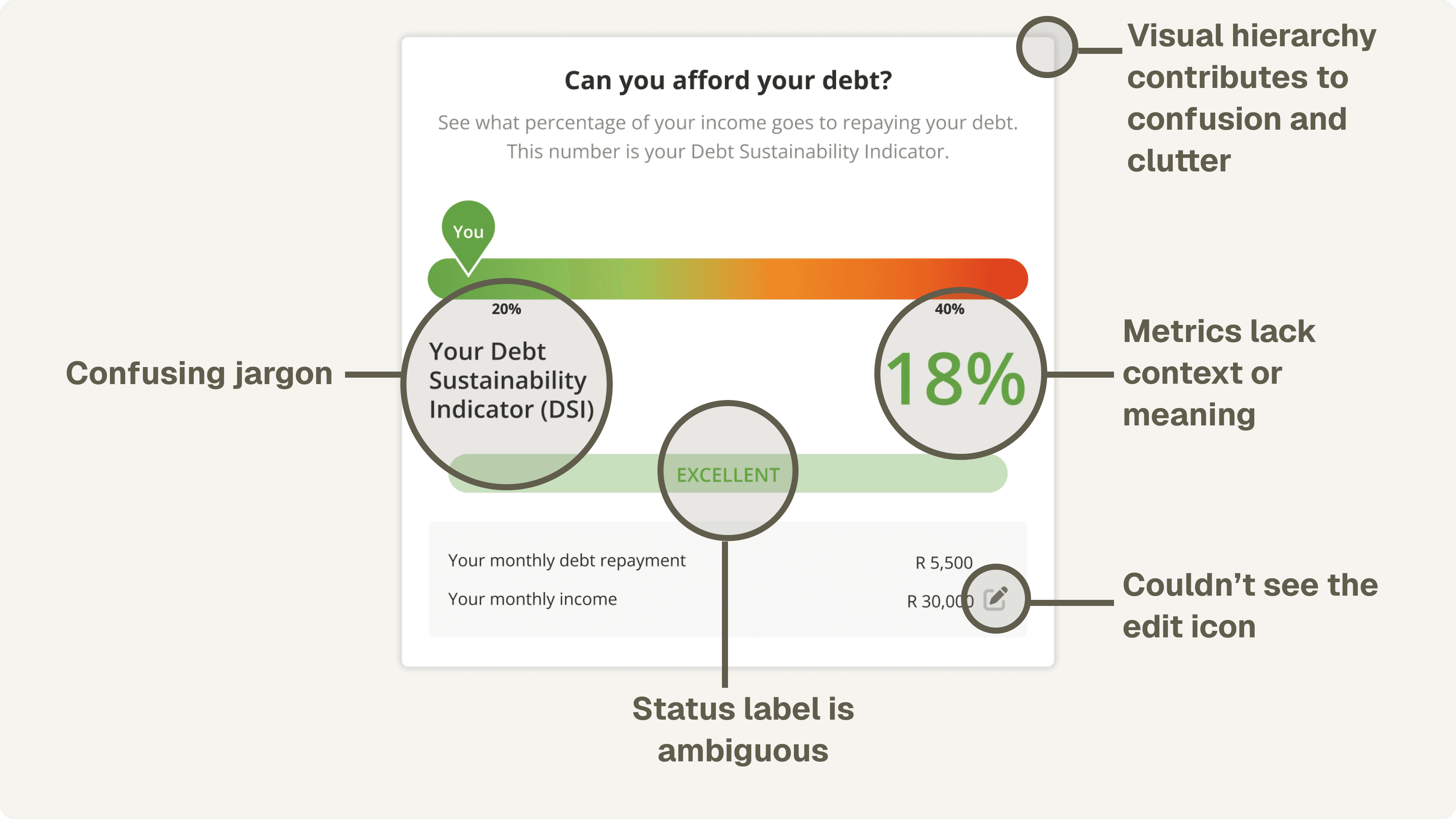
The original widget suffered from a lack of visual hierarchy, confusing gradient colours, and ambiguous copy that led to user confusion.
Users expressed a desire to understand the metrics, implying they would trust the brand more if they were given more context.
The original design only told half the story (the user's current situation). There was opportunity to use this same widget to overlay the company's solution. The hypothesis: by seeing the solution in context, a prospective customer is more likely to become a lead, and eventually convert.
Connecting the dots between the savings table on the Solution page and the user's situation in the DSI widget formed the foundation for the new design.
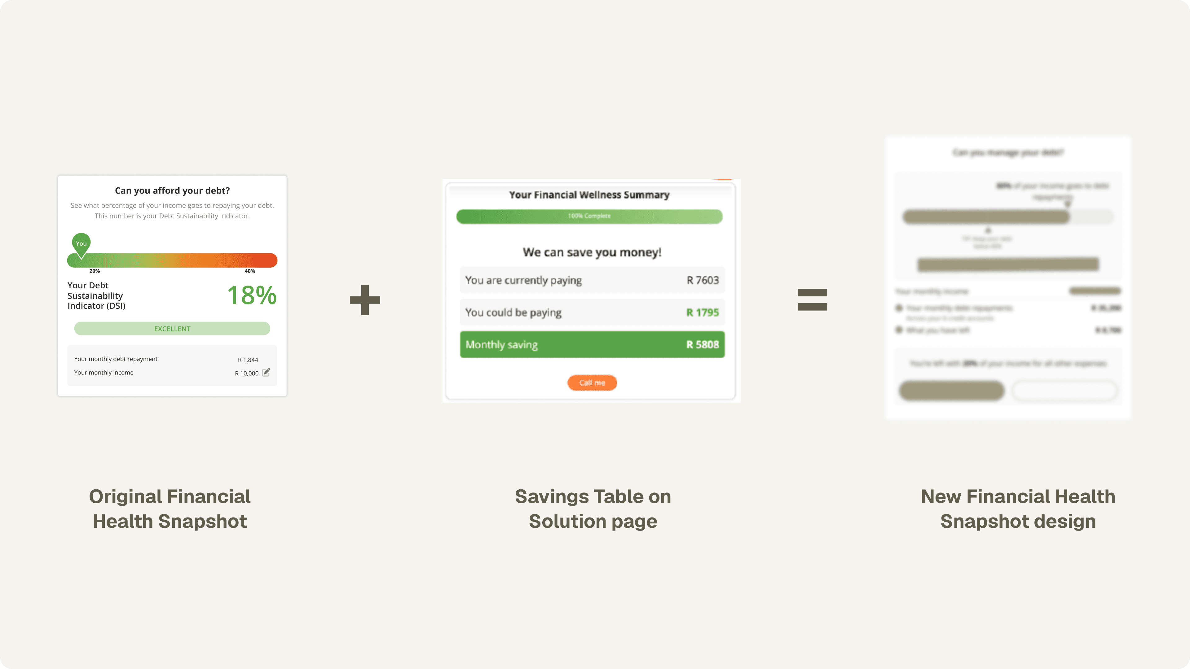
Wireframes helped inform the structure and interaction. I used Figma Make to capture animation details for the "solution mode" toggle, which helped when handing-off the design to the dev team.
In the "Solution mode", adding DebtBusters' value proposition as bullets directly addressed user frustration around understanding what financial relief the company provides. The "Why this matters" CTA addressed user skepticism around the metrics and calculation, opting for transparency over ambiguity.
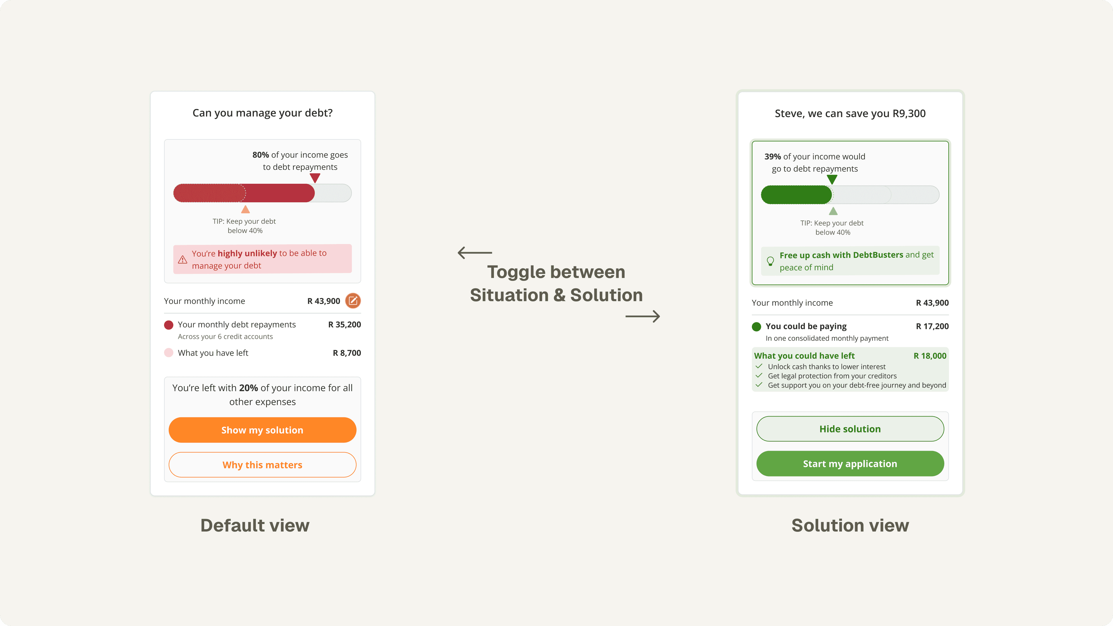
Users can toggle between the default and solution view. A 40% threshold marker was introduced to show the debt "safe zone". Gradients in the chart were replaced with a clear, solid RAG-scale colour system.
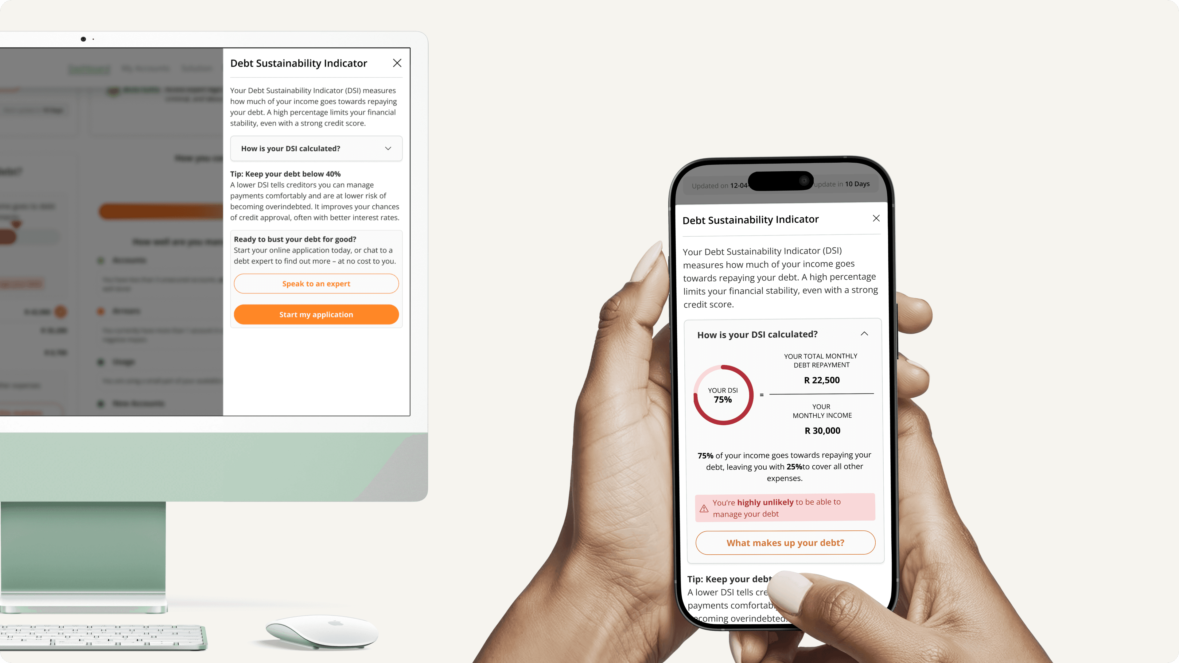
Progressive disclosure was used to gently expand further detail on the importance of a user's DTI and how it's calculated (using their own data to contextualise the calculation). For users eligible for DebtBusters' solution, a CTA is positioned on this slideover panel to continue the lead-gen journey.
20% of all conversions on the Dashboard page now driven from the new design.
The redesign resulted in the highest conversion rate of any Dashboard feature, with a 20% share of all Dashboard conversions from just 14% of leads. The "Why this matters" CTA is primarily responsible, confirming that users appreciate context and clarity before undertaking a serious financial commitment.
By showing users the solution in the context of their situation, using progressive disclosure to reduce overwhelm, and providing more context on the business's solution, the brand could solidify trust, and users felt more confident when proceeding to speak to a consultant.

This case study reflects my contributions to a feature built as part of my role at Confluent Services. All product assets and trademarks remain property of their respective owners.