Clients dropping out of a 5-year debt counselling process cost DebtBusters revenue and left vulnerable users without support. The challenge was to use design to keep them engaged and supported, especially in the critical first 3 months of the process.
My role
Owned end-to-end UX and UI design
Led stakeholder alignment across teams
Project type
Fintech
Client retention
Responsive web
Company
DebtBusters
Date
Aug - Nov 2024


The brief: make a 14-step legal process feel navigable, not overwhelming.
Debt counselling is a legally protected process, but a long one. Clients enter a 14-step journey and stay legally protected for up to 5 years while repayments are restructured. Most drop-off happened in the first 3 months, when clients had zero visibility into where they stood and every client who disengaged cost DebtBusters revenue and left a vulnerable person unsupported.
Limited visibility into the debt review process drove clients to call customer service for basic updates, increasing CSR workload and costs, while frustration and confusion pushed clients to terminate early.
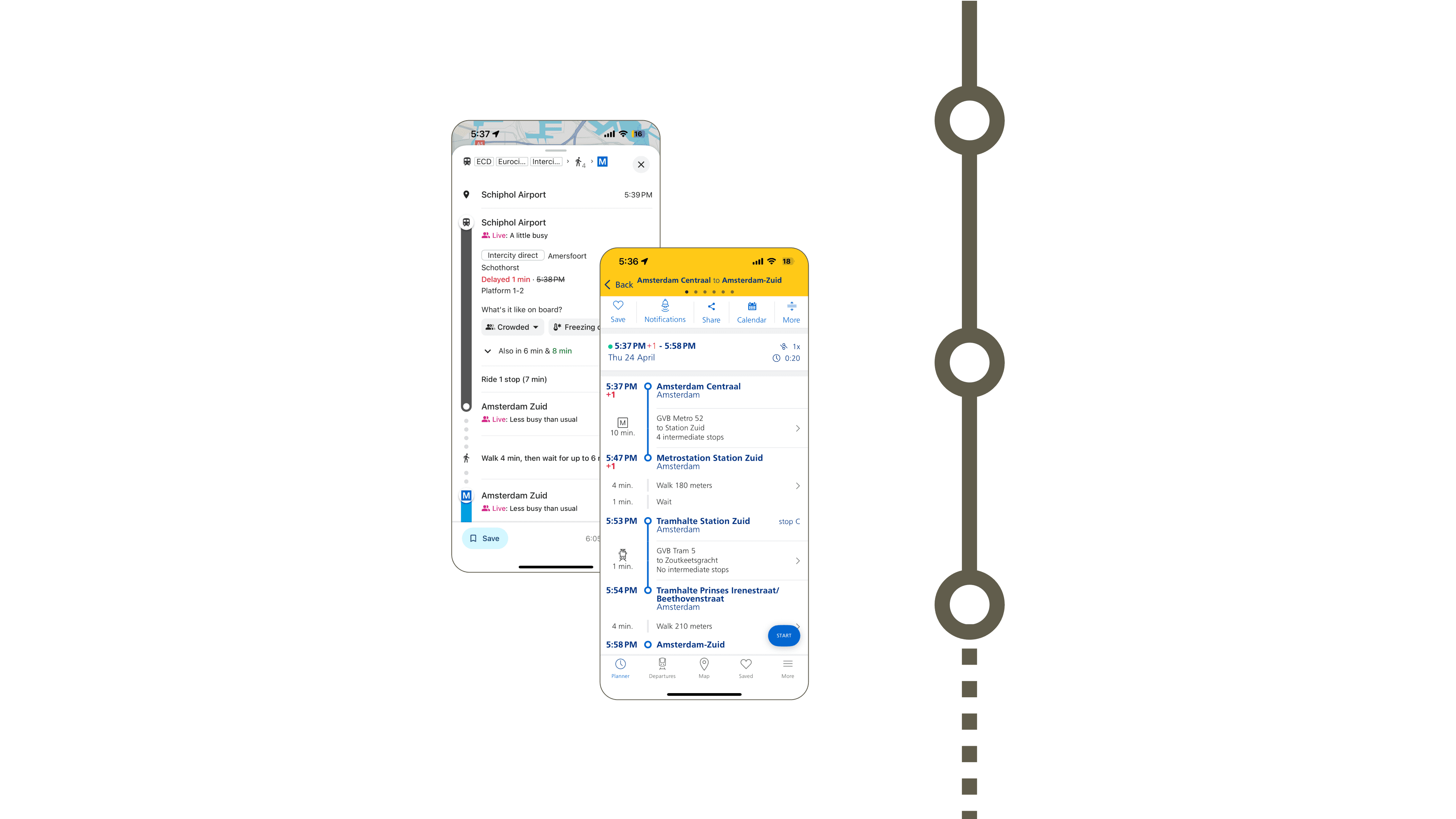
Transit maps solve exactly this problem, at city scale.
A subway map turns an overwhelming network into something anyone can read at a glance: you always know where you are, what's next, and how far there is to go. I adapted that same visual language to a client's debt counselling journey, treating each of the 14 steps as a station on a line toward one destination: financial freedom.
It gave clients something the process never had: a sense of place inside something legal, slow, and abstract.
Wireframes went through a round of testing before hi-fidelity work. Early feedback pushed the design toward two principles that shaped everything after:
Information chunking: grouping related steps so the full 14-step journey never had to be held in the user's head at once
Progressive disclosure: surfacing detail only as it became relevant, so the interface stayed calm even as the underlying process didn't
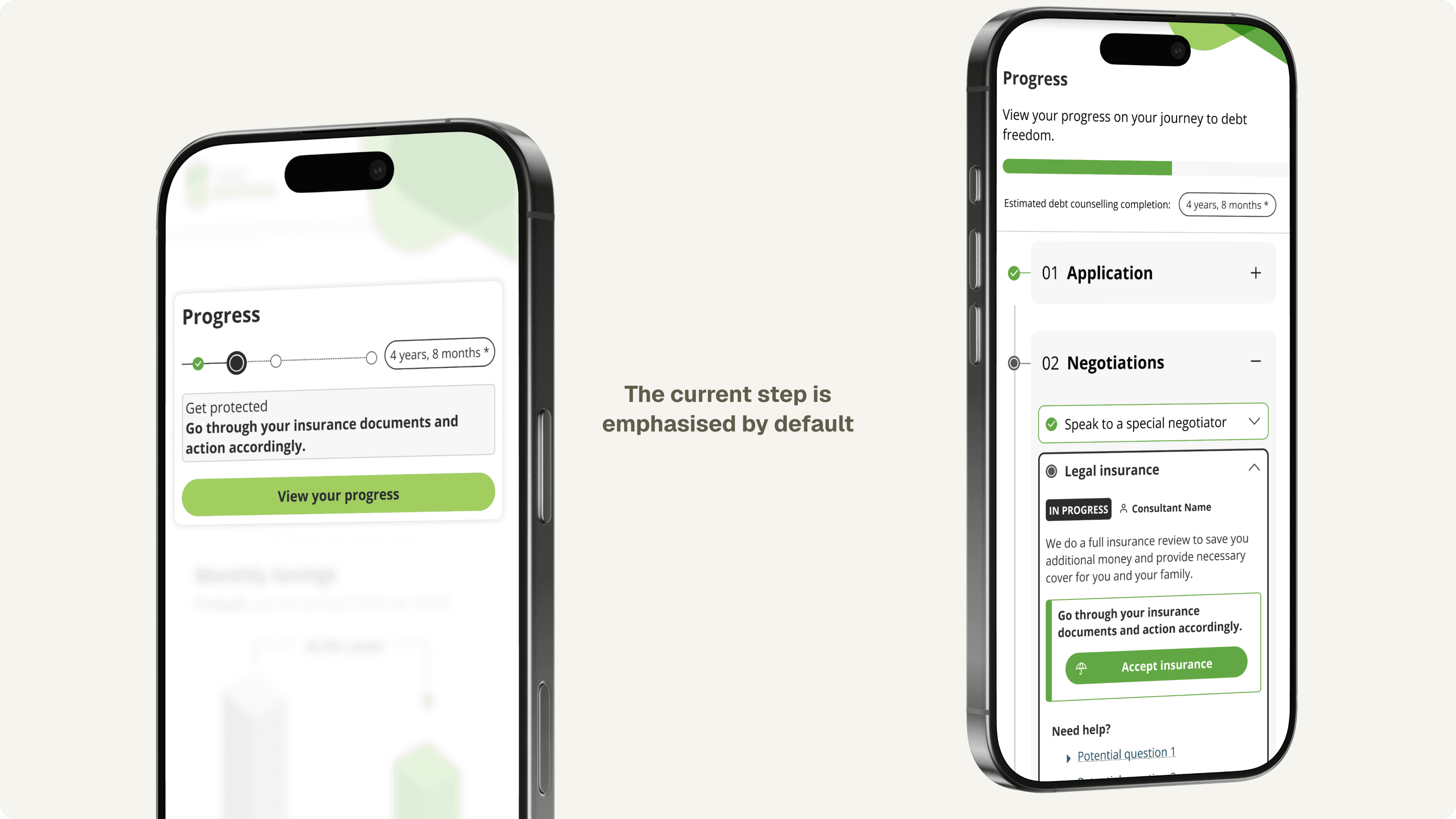
A Dashboard widget sits at the top of the first page the user sees when logging in. Important actions are highlighted in the info bubble. Opening the full Timeline page scrolls to the active step, with a consistent information structure comprising a status label, the consultant involved, and relevant pending actions for the user to take.
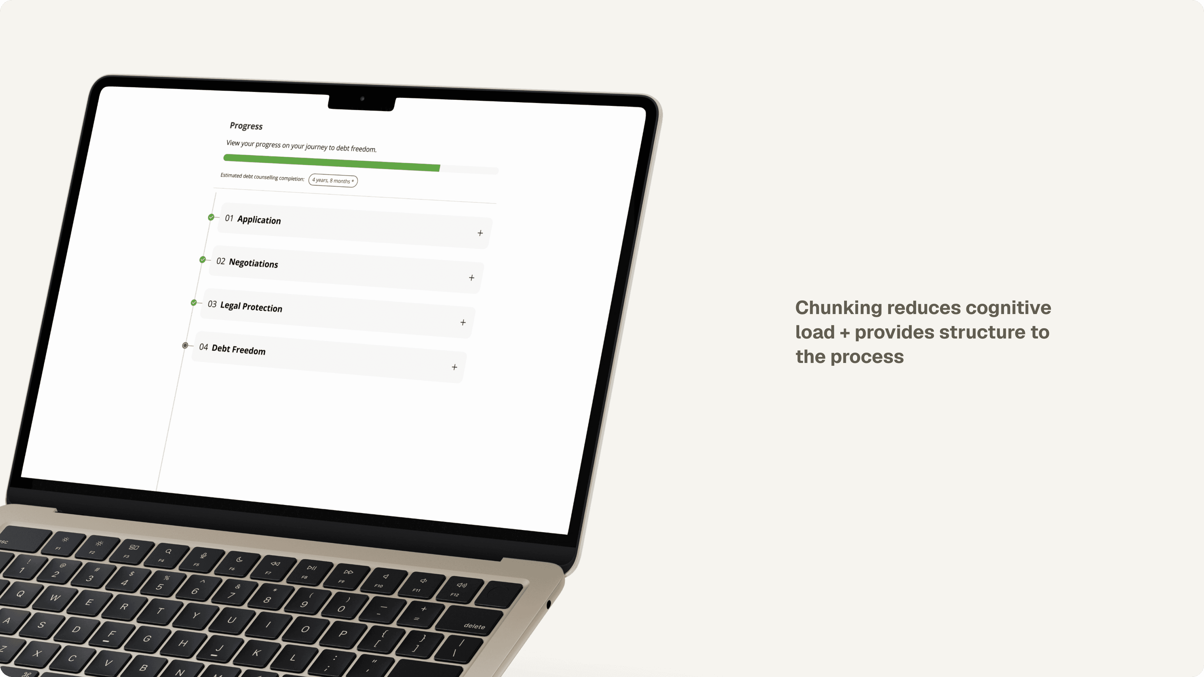
The 14 steps are chunked into 4 main chapters. The accordion-style interaction is intuitive and helps users explore the full journey at their own pace, whilst maintaining visibility over the current step they're in.

12% increase in client retention
Clients who used DC Tracker retained 12% more over 6 months, with a visibly flatter drop-off curve than clients without it, turning a feature built to support users into one of the business's clearest retention drivers.
This was my first project working across business units who'd never engaged with a UX process before. It taught me to translate design decisions into terms each stakeholder actually cared about.
Balancing stakeholder enthusiasm against user needs meant advocating for simplicity even when it wasn't the most exciting answer in the room.

This case study reflects my contributions to a feature built as part of my role at Confluent Services. All product assets and trademarks remain property of their respective owners.
Want to find out more about this project?
Full process available on request.